[post_page_title]The Popeyes logo finds itself the center of attention[/post_page_title]
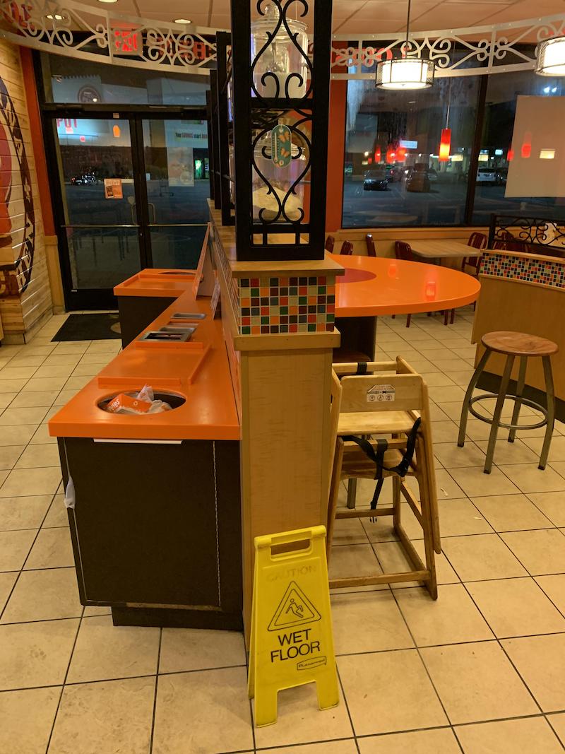
McDonald’s isn’t the only fast food chain to demonstrate their creativity when it comes to designs. Popeyes chicken, too, has got the chops. What looks like just a round eating area on one side and trash receptacles on the other side is, upon closer inspection, actually the P of the Popeyes chicken logo. Talk about ingenuity. Five — okay, ten — clapping hands emojis for whoever thought of this collage-sculpture-advertising art piece.

Pages: Page 1, Page 2, Page 3, Page 4, Page 5, Page 6, Page 7, Page 8, Page 9, Page 10, Page 11, Page 12, Page 13, Page 14, Page 15, Page 16, Page 17, Page 18, Page 19, Page 20, Page 21, Page 22, Page 23, Page 24, Page 25, Page 26, Page 27, Page 28, Page 29, Page 30, Page 31, Page 32, Page 33, Page 34, Page 35, Page 36, Page 37, Page 38, Page 39


